My Yesterday in Pictures Format
I’ve simply built my daily walking & painting up to the point where I need the time for these two vital parts of keeping me healthy and/or sane, lol!
My Day Ahead series posts will continue, but on a much more intermittent basis. Already it seems some of that series’ usefulness is being incorporated into this new series’ format, me yakking ‘bout what when on, on the yesterday part of my life anyway, lol! It’s a continuing experiment of course, so we’ll see 😊
*
On the last day of the year of the last year of the decade, I thought a short post summarizing one small creative process I’ve just recently started using, would be nice, plus appropriate as something “barely” old yet transitioning into the new decade for me with my art 😊
One of the most significant challenges of beginning to create softer watercolor-ish via acrylics style paintings has been how to photograph them as they actually appear.
I’d mentioned in a recent post that the camera features in my iPhone XR that make for great portraits and landscape & flower photography, really crank up the detail and coloring too much for these much softer recent paintings.
Though I’m still experimenting, the steps below are ones I’ve found I can consistently go to help reduce any garishness, noise, and undue contrast. I’d highly recommend also experimenting if this is something that appeals to you as something you could use or just like trying out. I’d esp recommend also tinkering with the Vibrancy and Saturation settings, then dialing detail and/or color back in via the Brightness setting, vs Exposure. But experiment. See what happens 😊
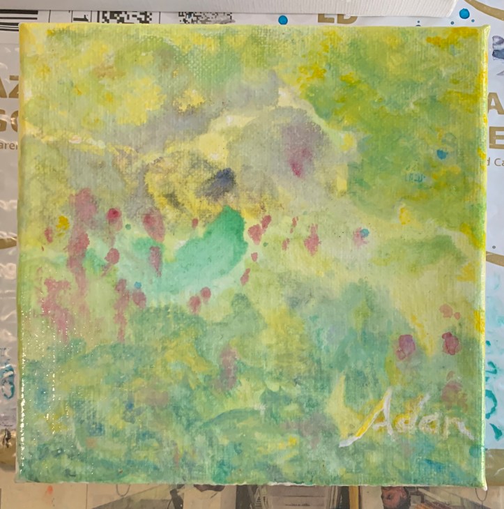
So this is the photo of my very first 6×6 Absorbent Grounds acrylic experiment, finally finished (I’ll have a full post on the process start to finish once the varnishing is done), with its first (maybe final) coat of Gamblin Gamvar removal varnish. The white absorbent ground I used is via Golden (they provide a lot of good info on their site). I’ll probably also be trying Daniel Smith’s black watercolor absorbent ground version in the future – more fun experimenting! ❤️
So, back to my photo of my art piece. You can actually see some of the vertical ridges of the wet varnish still gleaming on the bottom left.
I have a “little” less trepidation (literally how I felt the 1st time), seeing my soft work of art appearing slightly harsher and Halloween-ish – knowing that previous applications of a glossy glare-producing medium, like the the isolation layer mix of Soft Gel Gloss & water, did finally fade, allowing my painting to become itself again!
This morning (Tue, New Year’s Eve) I could already see that restorative magic in process as the varnish continues to dry (whew!) Technically, it’s dry. But in terms of the degree of whatever full transparency the varnish’ll have, I really won’t know for another day or two. And even for a few days after that, it seems the paintings continue to mellow out to what I envisioned & saw when I decided the work was done. I’m hoping for the same this time around 😊

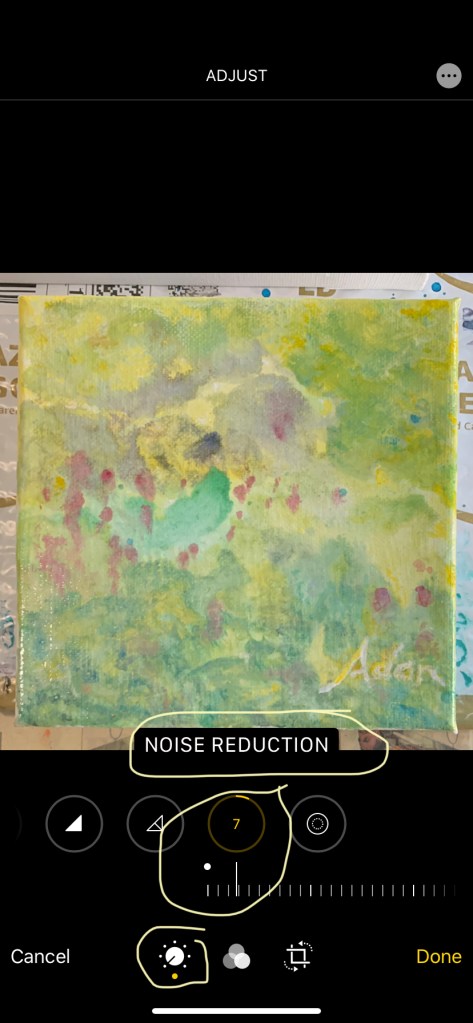
I typically start with Noise Reduction, but am beginning to trust the process enough now I go down the line so to speak of the adjustments available. If this was a typical photo, I might stop closer to the start, with Brilliance or Saturation. Here, I go on to Contrast. The number shown, minus 11 (-11) is a very small adjustment. These are accessed via the bottom left control, with nthe mid-option for Black & White, and the right side option for cropping and (recently added within it) vertical and horizontal rebalancing, which is super handy!
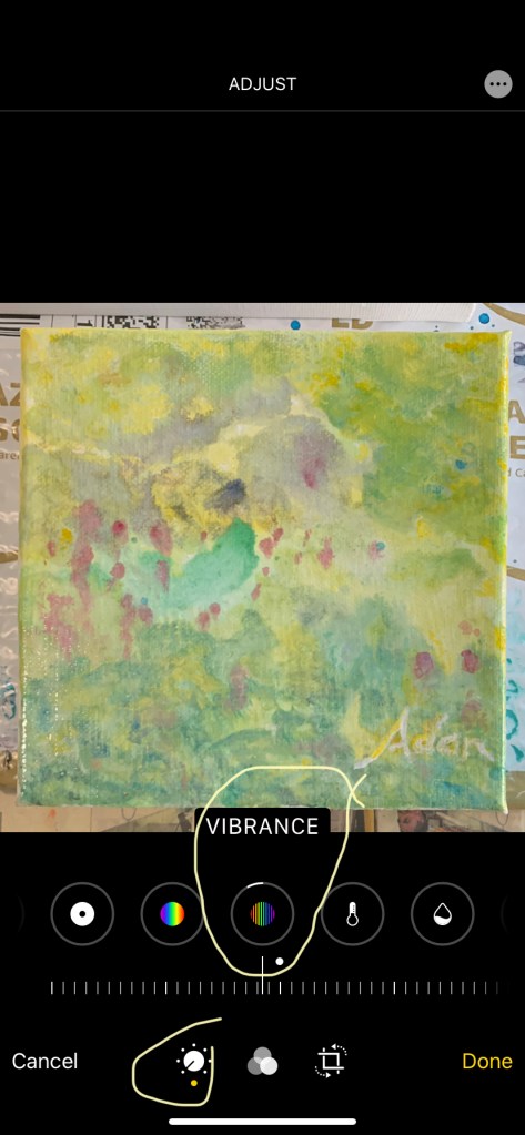
Next I like to reduce the Vibrance. On a multi-surface, multi-layered (paints and mediums) surface, too much Vibrance seems to over-accentuate the ridges and glossy spots more than noticed in a real look at the work. Notice again how tiny the adjustment is. These controls, both increasing & decreasing the various visual options, are very powerful!
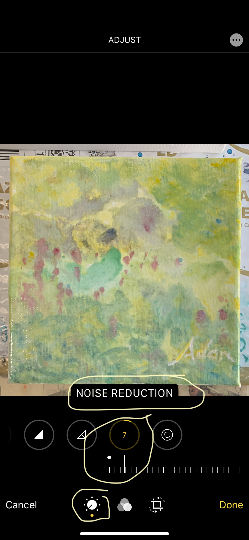
Below, what completes the magic of showing me more closely what I see when I see my work – “in person, lol 😂” – is Noise Reduction. A few of the sliders, like this one, don’t go + or – but rather from zero on up. This control, so far, has been the most beneficial, though by itself, not enough.
Photo Adjustment of In-Progress 6×6 acrylic on Absorbent Ground, step 1 of 4 12.30.19 Originating Photo 
Photo Adjustment of In-Progress 6×6 acrylic on Absorbent Ground, step 4 of 4 12.30.19 Reduce Noise Closeup Crop
lighter, less scratchy, more settled. The painting will look even better once the varnish is fully dry (I hope 😊)
It’s worth also playing with Black Point, and really all the others, just to see how they affect an image.
My biggest initial challenge – and frustration – was moving a slider to a point I liked, but to see if I could make it better (sound like a familiar strategy? 😊) I move the slider some more, then can’t remember the setting number I’d liked before, lol!
Sometimes I made a point of remembering the setting number, then of course forgot it as I continued to experiment. I finally figured out, if I go back to the center setting, or zero to the left if the slider works that way, ignored the numbers, and stopped when I got to or near the feeling I remembered liking so much before, that that would work! But that only works for me if I first experiment and see what the sliders produce to their full strength in both directions (or the one direction if it works that way).
Hopefully, next year, next decade (now less than 5 hours away here in Central Texas 😊) as I talked about in a previous post, I’ll have some of these new experimental 6x6s finished, really finished, and do a good post for each one that had something different going on I learned from. Right now that means all of them 😂
That’s ok. I’m enjoying it, truly ❤️
Happy New Year everyone! Stay well and healthy and creative – in anything good and healthy for you (and by extension, others) 💕
From a clear cool night, hours from 2010 in Austin Texas, good night ya’ll 😊
Adan
*
My Day Ahead series posts, an intermittent series, elaborates on both my day ahead & the day past, my yesterday 😊
The My Yesterday in Pictures series is currently also posting intermittently ❤️
Adan
*
My Related Amazon Affiliate Search Products For This Post
https://www.amazon.com/shop/felipeadanlerma
My Latest Posts On My Website!
- Sold! At SaatchiArt — Tender is the Night 2024 – With much thanks to my buyer in Brooklyn NY!“Not only am I grateful to my Brooklyn buyer, but also to Saatchi Art that literally navigated me through the ice-storm prolonged process last month here Austin!”
- New Painting Series – Island Land Trail Sunset Vermont 2026 – Gaining Perspective About My Experience of Painting Doing Series of SeriesIt’s a welcome surprise to realize how rich one’s life experience can be, even within seemingly single short time frames themselves! I feel this new small study, with its misty soft blues and distant vistas is a nice reflection of that.
- Voter ID – ReVisiting John R. Lewis’ 2021 Voting Rights Proposal That Failed – What’s Different Now – And Why Not Debate it With the Current 2026 Voting Rights – Together?This is a short post I seldom write up. A political post. Understandly so. There’s a lot of the usual “they” don’t want this or that now talk from this or that political party.
- Are We at Our Kent State Moment? – One by One the Women Came and Said, It’s Time 2026 9×12 acrylic on canvas panel – by Adan – @SaatchiArt 😊“I still vividly remember the images on TV 1970 of students my age shot and on the ground during a demonstration against the Vietnam War”
- 1st Cabin Light Finished Painting 2026Saturations of sky and earth roll and rest spin like a first slow dance in junior high – middle school the grandkids laugh and tell me they think I make all this up just to be funny 😊
- 1st Cabin Light Study 2 2025Yes. The new day has begun….
- 1st Cabin Light Study 1 2025I wasn’t sure when to stop but my own waves of self, conscious of the need to rest joined the earth before me, an image shaped by pigments from itself.
My Related Posts Here On My Blog
*
Thanks everyone! 😊
Adan
Twitter / Instagram / FB @FelipeAdanLerma
Amazon Author Page – https://amzn.to/2YpgyUf
Fine Art America (FAA) – https://fineartamerica.com/profiles/felipeadan-lerma.html

Leave a comment