Photographic Nuances
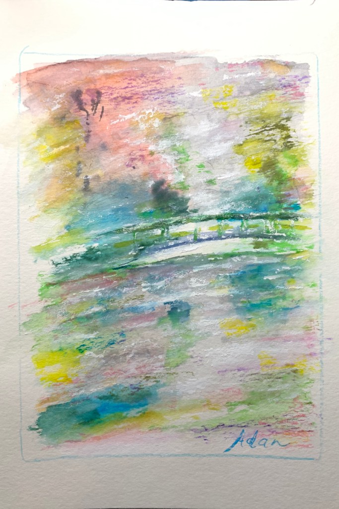
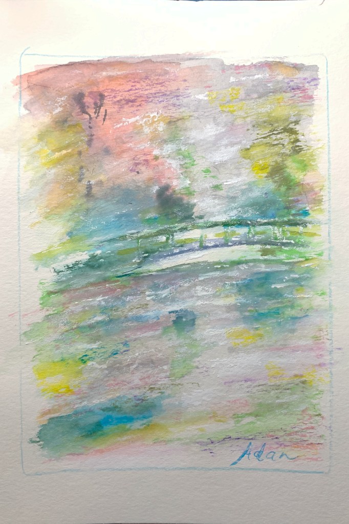
Monet’s Garden April Rain in Giverny, Gouache ©Felipe Adan Lerma
https://felipeadan-lerma.pixels.com/featured/monets-garden-april-rain-in-giverny-watercolor-v2-felipe-adan-lerma.html
The Why 😊
Yesterday I posted a couple of my watercolor renditions of my mini-Monet’s Garden series of posts, but was immediately unhappy with how one of the two appeared on screen.
The 2nd rendition, to the right of my 1st rendition on its left, is closer to my original than that on the left.
While the 1st rendition is a bit more dramatic, it’s not what I tried to create with my new set of gouache colors. I did want energy, but softer, more nuanced, and I think the 2nd pic captures those color-tone drifts (for lack of a better word) more accurately.
The emotional intent is also better – the 2nd image not only being more restful, but surprisingly inducive to seeing distance, especially beyond the bridge and in the sky.
It’s more important, I think, to capture my intent, vs an unexpected more dramatic rendition-possibility. The latter can always be presented as an alternative print version, or even tweaked into a dramatic digital rendition – kinda like in my tweet below of one of my watercolor renditions of this same scene in Giverny.
Photographing one’s art is, for us non-professionals, at best a practiced hit and miss, lol!
The How 😊
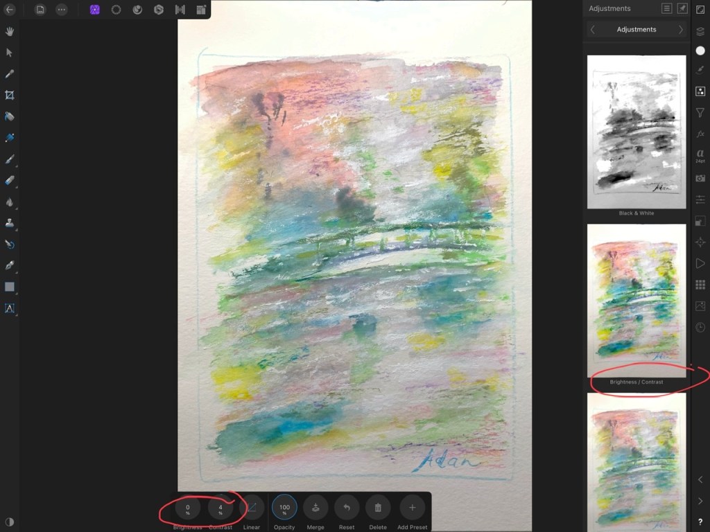
Affinity Photo‘s been my go to photo editing software for several years now, and was fortunate to have good results with one of their more readily accessible options – Brightness / Contrast.

https://felipeadan-lerma.pixels.com/featured/monets-garden-april-rain-in-giverny-watercolor-v2-felipe-adan-lerma.html
Granted, I’d already adjusted the temperature and tint of the original image via my iPhone’s image editing software, but I still couldn’t quite finesse the result I wanted like is usually the case, thus my need to tweak via Affinity.
Black and White Variation
There’s lots of options to explore with Affinity Photo. One, creating a black and white rendition, is seen just above my circled item on the right. What’s interesting, I think, is the offered BW translation, as I’ve found has usually been the case, is almost always not the version I prefer in black and white!
I end up creating my own emotionally preferred version in this interesting version-option.

It was interesting to create not only because I varied it considerably from the preset BW offering I above the right side circled item in the Affinity screenshot above, but also because I was fortunate enough to tinker-find a blend that kept the more dramatic option, yet also softened it.
*
That’s it for today in my Monet’s Garden series. I’m hoping to finish my gouache version very soon, and anxious to try out an acrylic version with a new 60-tubes set of acrylics from Arteza! 😊
Take care everyone, stay healthy!
Adan
This series – Monet’s Garden April Rain in Giverny –
https://felipeadanlerma.com/tag/monets-garden-april-rain-in-giverny/
Twitter / Instagram / FB @FelipeAdanLerma
Amazon Author Page – https://amzn.to/2YpgyUf
Fine Art America (FAA, Pixels) – https://felipeadan-lerma.pixels.com/
Direct link to the image in above tweet at Fine Art America –
https://felipeadan-lerma.pixels.com/featured/monets-garden-april-rain-in-giverny-watercolor-v1-digital-felipe-adan-lerma.html
Monet’s Garden, my Google search
My Related Posts Here On My Blog
My Related Amazon Affiliate Search Products
https://www.amazon.com/shop/felipeadanlerma
My Amazon search for Monet (books, videos, wall art, puzzles +) –
https://amzn.to/3shCH7b
My Amazon search for Impressionsim –
https://amzn.to/3nitGHg
*
  |   |   |
  |   |   |
  |   |   |
  |   |   |
My Latest Posts On My Website!
- Side by Side, Comparing the Same File With Differing Export Settings – 10.18.26, Updated 101926I feel this new format now presents the physical presence of my work closer to actuality as I myself see it, especially in regards to textures, colors, value changes, etc.
- Reformatting Images of My Art for Truer Representation, Even if Only Slightly“I know 1st things I’d want to know is how are my newer images better, and how can I apply this to more of my work….”
- My Most Viewed Image Last Week at #FineArtAmerica – Praying Together 2026 8×10I feel this new format now presents the physical presence of my work closer to actuality as I myself see it, especially in regards to textures, colors, value changes, etc.
- Reformatting Images of My Art for Truer Representation, Bit by Bit, LiterallyI feel this new format now presents the physical presence of my work closer to actuality as I myself see it, especially in regards to textures, colors, value changes, etc.
- Color & Texture — Texture & Color
- My Original Source Photo for Series of New Paintings – San Francisco Golden Gate BridgeThe image opportunity itself was via an evening boat ride my wife Sheila and I took on our so-far only trip to San Francisco a couple years ago.
- Intro: Grappling With Organizing My Series Paintings from My Original Photos into GroupsMy Collections page at Saatchi Art includes collections by style or place plus works in a specific series. Best I can do for now, lol! Hopefully improve over time 🙏 😊
*
Thanks again, everyone! 😊
Adan
Twitter / Instagram / FB @FelipeAdanLerma
Amazon Author Page – https://amzn.to/2YpgyUf
Fine Art America (FAA, Pixels) – https://felipeadan-lerma.pixels.com/

