As mentioned in my prev post, my then problem and now radical solution in re to a painting I’d struggled with, done the most I felt I could, and was still quite unhappy with, began after reading then reblogging Dianne Mize’s most recent art tip, The Visual Path, plus some reading I’ve been doing in The Adjacent Possible, re listening to one’s creative needs and acting on them.
I’d wanted to add a violet toned painting to one of my ongoing series, one involving 12×24 panoramic monochromatic impressionist abstract work.
It began well enough, with the new work containing both some interesting up-close texture, and a fairly interesting middle-distance view – but it felt too dark to. I worked fairly steady over several days adjusting the tones and creating more white space, eventually creating a much more pleasing lighter version, with some white space, and some degree of visual path, esp when seen up-close.
But seen further away, even 6-12 feet away, it looked like a large dark lump, lol!
So I made a choice, radically enhancing the small ribbons of white.
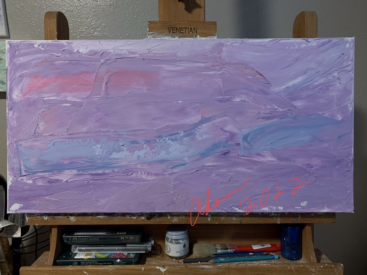

But that not only failed to make the picture better, it effectively wrecked it.
So I tanked the original and started over, painting over the old painting, with a solidly lighter pigment, in the process creating even more texture – and – those needed spots of light, or I should say, contrast, that made the image work much better for me —
up-close and from a distance —-
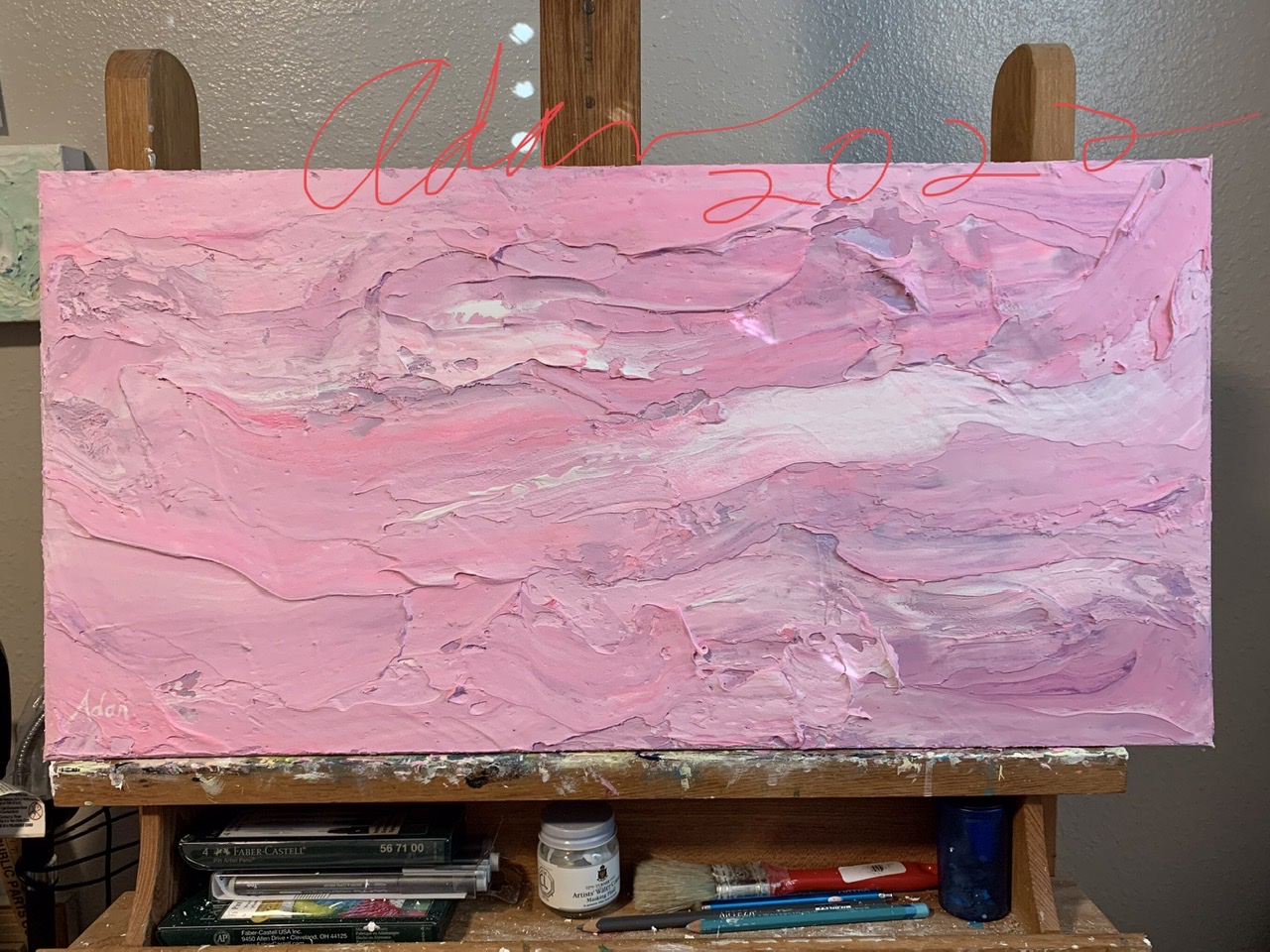
Though it could be argued, or I should say, could argue with myself that, truly, both images had “paths” – I felt the visual path and mood in the newer pink version was much more distinct, esp from a medium/further distance.
In essence, seem from 12-15, I still wanted to approach the pink version and inspect it more closely. I never quite got that feeling from my darker deeper violet version.
Beyond that, I just feel better looking at the pink vs the violet blue!
Does that mean I should give up on a violet version – naw!
Does mean I need to give it, ie me, time ❤️
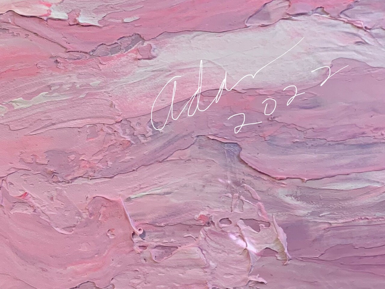
I’ll leave it at that with a cropped-closeup of what’s my 1st, and probably final version, of Pink Impressionist Abstract 1 — it does a much better job of catching my eye, emits a much more active-positive mood for me, and packs a heck of a visual textural feast up close.
Here’s a taste 😊 —
Stay well everyone – keep your dreams close to your heart, it’ll show, even from a distance ☺️
Adan
My Related Blog Posts
*
My Related Amazon Affiliate Search Products
https://www.amazon.com/shop/felipeadanlerma
My Amazon search for Dianne Mize —
https://amzn.to/3cLgetz
https://amzn.to/3ob5omA
*
Twitter / Instagram / FB @FelipeAdanLerma
Amazon Author Page – https://amzn.to/2YpgyUf
Fine Art America (FAA, Pixels) – https://felipeadan-lerma.pixels.com/


Leave a comment