It began after reading then reblogging Dianne Mize’s most recent art tip, The Visual Path, plus some reading I’ve been doing in The Adjacent Possible, about listening to one’s creative needs and acting on them.
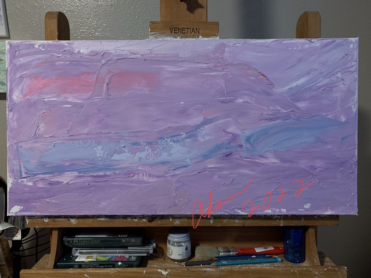
I’d already begun a new violet lay-in, destined, I thought, to be called Violet Impressionist Abstract 1; all along the lines of my other mostly-or-all monochromatic impressionist abstract work I’ve posted about ( my red and blue samples further down ).


I played with the idea of settling for the 1st version, telling myself it could be an “evening” abstract; and maybe it could’ve been. But I really just didn’t like it enough.
The idea of layering more thick, wide layers of paint over it “kinda” appealed to me. I’ve had “some” success doing that, nothing to be confident enough about yet though 😊 But at least I avoided kidding myself I’d be happy with the 1st version.
But I really wanted this violet version to work, somehow. But didn’t know how.
So, as part of my going-to-bed reading, I remembered Dianne’s latest art tip, read it again, got up and stared at my painting in the art room, looked at it through the doorway from the living room, and began to see what I “might” be able to tweak, then see, if applying Dianne’s visual path tip might make the difference.
I thought of applying thick layers of contrasting colors in strategic points to create both more light and direction, but knew from experience, the thickness of the current paint on the canvas would mean, once the 1st few new thick passes of paint were applied, I’d soon be on my way to an entirely differing version of what I started, even if possibly better.
“Happy Vines Healthy Heart” is an example I did do this for, applying thick layers over the bottom 2/3rd. And even if not perfect, I’m a lot happier with it than if I hadn’t taken the slash-and-partially cover / partially reveal painting path. Btw, the soft stained-painted section top 1/3, I left as-is, creating a nicely fit juxtaposition —


Healthy Vines Healthy Heart ©FelipeAdanLerma in progress Jan 2022
Related Post
January 13, 2022 – 2 New Works In-Progress : Good Conversation + Healthy Vines Happy Hearts – #AbstractPainting #LyricalAbstraction #TheAdjacentPossible
Instead, for Violet Impressionist Abstract 1, I opted for a version of my equally textured, but then stained/accented painting, “Fantasy Walk,” which of course does differ in not being a panorama and for including a figure. Otherwise, still a good example, lol!
Fantasy Walk ©Felipe Adan Lerma, 16×20 watercolor on light absorbent ground on canvas
Related blog posts
https://felipeadanlerma.com/?s=Fantasy+walk
And thus ended up with —

The rose and pinkish colors are still not as visible as to the naked eye, and obviously, depending on the desired end-product-image, but this is very close to what I wanted – a largely violet image exploring differing tones of it as the dominant theme.
All in all, much closer to my other recent single-color dominant panoramas –


https://felipeadan-lerma.pixels.com/featured/blue-impressionist-abstract-1-felipe-adan-lerma.html
*
side view, Red Impressionist Abstract 1 ©Felipe Adan Lerma 12×24 acrylic with light absorbent ground on gallery wrapped canvas Dec 2021
https://felipeadan-lerma.pixels.com/featured/red-impressionist-abstract-1-felipe-adan-lerma.html
*
Related blog posts
https://felipeadanlerma.com/?s=Impressionist+abstract
But then — after living with it all day, checking in on it, and really liking the “little touches” of texture and color accents throughout — I realized it was still not what I wanted.
And still wanted….
So, next morning, I made a decision to apply the layers of paint the way I wanted them to be to begin with, and, knowingly, wreck the above painting.
In Part 2, assuming I don’t choose to wreck-again and start-over, again, I’ll show ya’ll what I came up with.
The newer work, I think, looks better from both a mid and further distance – and – up close, something I value & recently brought up in a post titled, December 14, 2021 – What I Used To Want My Art To Do; What I Want My Art To Do Now . But it’s an entirely different painting now….
*
Stay well everyone – stay curious – stay hopeful! And stay creative!! ☺️
Adan
My Related Blog Posts
*
My Related Amazon Affiliate Search Products
https://www.amazon.com/shop/felipeadanlerma
My Amazon search for Dianne Mize —
https://amzn.to/3cLgetz
https://amzn.to/3ob5omA
*

Twitter / Instagram / FB @FelipeAdanLerma
Amazon Author Page – https://amzn.to/2YpgyUf
Fine Art America (FAA, Pixels) – https://felipeadan-lerma.pixels.com/


Leave a comment