 |
In the Yang and the Yin symbol, as in Notan, opposites complement, they do not conflict. Neither seeks to negate or dominate the other, only to relate in harmony. It is the interaction of the light and the dark, therefore, that is most essential.
https://amzn.to/2NgrKz8
*
The above quote is from the forward. It’s short, but dense with thought and implications. Most of which I immediately agreed with, having thought them to be so somewhere sometime along the way, my creative way at least 😊
But they added up, brought together the way they were, with verbal visuals laced with meanings related to the notion of Notan.
It was the way the visuals and the verbal, as exemplified in the above quote, worked together that created what another quote in the forward, near the end, expressed —
“At the end of this series of problems, the student will be able to identify Notan both as a concept and as an experience.“
It was that that’d grabbed me along in such a few short pages, the experience.
The concepts I had known, as bits and pieces, unlinked.
The experience, I had not…
I’d felt like how I’ve seen the silver shutter of a camera flip and catch the light bringing that moment’s reality to one’s eyes. Almost magic. An alteration of perception.
I was right, though hadn’t thought so, to go slow w/my new Notan book, and let the initial concept sit and grow within me.
This book can obviously be read or skimmed in one short sitting.
But if there’s one thing my recent surgeries have impressed and imposed upon me, it’s that gulping down chunks of food, or knowledge, isn’t nearly as much fun now. And never was that productive either 😊
I have no timetable for when or if I’ll do another update-review on my reading of Notan, but I am hoping and expectant my anticipation of good eye-opening ”things” still to come will be more than well founded 😊
Either way, if and when I do another update-review, I’ll try to find an image of mine I felt seemed to embody the new concept.
A black and white seemed most appropriate this time around —

https://fineartamerica.com/featured/jean-beauvais-paris-felipe-adan-lerma.html
Interaction, between the dark and light, above, seems to be the operative word.
Looking at the blocks of black shadows either side, the bldgs surrounding two sides of the square, Jean Beauvais, I almost feel they are the negative or receding planes, with the lit square, and back-lit (by the sun) rise into the Latin Quarter, the positive or protruding planes. Yet, as Dianne Mize (another artist I’ve been following recently) points out in many of her instructional material, there are gradations with those dominant sectionings. Slivers of light and fading sides of bldgs reveal the mass of aliveness within the dark planes. And on the square particularly, commas of black rise, interacting in the form of birds & their shadows. I even placed my signature on the bottom right, with an intensity to match the rays of sunshine on the bricks on the far right of the trees, interacting with the both the extended light on the bottom right and the shadows rising from the left bottom corner.
Though I fine-tuned the image when I converted it to BW, there wasn’t a whole lot I needed to do to make this moment happen as well as it does in black and white.
Paris, I think, can do that 😊
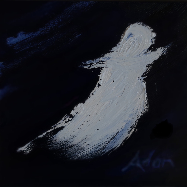
Below, is a painting, Angel, a small 8×8 inch gallery wrap oil I like very much, but, doesn’t work quite as well, though it’s not bad.
My only excuse is my intent was to experience (not thinking about Notan, or having heard that word much at all before) the contrast and relief (funny, the dual definitions of relief here 😊) between the white paint against the black canvas.
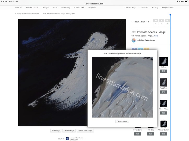
On the detail screen shot below the image is a screenshot from my Fine Art America page for Angel using the site’s high resolution preview feature – just tap the image with your finger or cursor, a green outlined box will appear, tap again where you’d like to see a detail resolution of, and it should appear.
https://fineartamerica.com/featured/8×8-intimate-spaces-angel-felipe-adan-lerma.html?newartwork=true
Even on my reduced resolution image imported WordPress Media file, the detail of the paint texture shows up pretty well. Not like the original of course, but that’s to be expected.
I did lay in some faint blues in lightly brushed strokes and in my signature toward the top left and bottom right corners, and that helps balance the image as a whole.
So what do I see as “wrong” with the finished work.
Not a whole lot, but, other than a few practice strokes to create the angel shape I wanted (our six year old says it’s a ghost 😊) I didn’t scale the image into the 8×8 work space well enough. Thus the (here’s that word again) interactive placement of lighter paint on the darker canvas.
My 1st impulse, when I’d gotten to this point, and if I were to work on this more (which I probably won’t) was to add more robe or wing to the figure’s bottom left, swelling it so to speak above the bottom left of the figure. But I had this terrible feeling I’d definitely ruin it, lol! That knowing-when-to-stop thing again 😊
And, having read and thought about the interactiveness of dark and light via this book, especially in regard to this picture, I think now the 1st impulse, to add more white, not only wouldn’t work now, but that rather the reverse, a gradation of the black field to an even deeper black, to the bottom left of the angel, would be better, creating more depth between the angel and the blue wisps top left.
But other than creating a “little” more texture with black paint, there’s not much I know how to do right now to “deepen” that area (vs making lighter) to the bottom left of the angel.
So, for now, this image stays as is, lol! ❤️
https://fineartamerica.com/featured/8×8-intimate-spaces-angel-felipe-adan-lerma.html
Currently For Sale – $50.00 + $10 insured shipping domestic U.S.
[ Update 12.11.19 – this image sold at Donn’s Depot Christmas Bazaar ]
As I mentioned near the top of this much-longer-than-expected post, lol, I’ve no real idea if or how many follow up reading-reviews of Notan I might do.
I’m assuming there’ll be quite a bit more to pique my interest 😊 I took a quick peek and saw just enough to add to the growing realization of how the interactiveness can create dominance within both the light and dark fields as (as quoted at top) complements.
And if I do a followup, I’m also assuming at least one or more would also use some of my BW imagery, though I’m hoping to learn enough to apply this to color, and realize (to myself) examples from my own work.
Dianne Mize, also mentioned earlier, speaks of this as shadow and not-in-shadow, and how this interaction creates pleasing dimension.
We’ll see what I can see ❤️
Adan
*
My Related Amazon Affiliate Search Products
https://www.amazon.com/shop/felipeadanlerma
You can also begin a new search from any image below 😊
My Latest Posts On My Website!
- My Original Source Photo for Series of New Paintings – San Francisco Golden Gate BridgeThe image opportunity itself was via an evening boat ride my wife Sheila and I took on our so-far only trip to San Francisco a couple years ago.
- Intro: Grappling With Organizing My Series Paintings from My Original Photos into GroupsMy Collections page at Saatchi Art includes collections by style or place plus works in a specific series. Best I can do for now, lol! Hopefully improve over time 🙏 😊
- Sold! At SaatchiArt — Tender is the Night 2024 – With much thanks to my buyer in Brooklyn NY!“Not only am I grateful to my Brooklyn buyer, but also to Saatchi Art that literally navigated me through the ice-storm prolonged process last month here Austin!”
- New Painting Series – Island Land Trail Sunset Vermont 2026 – Gaining Perspective About My Experience of Painting Doing Series of SeriesIt’s a welcome surprise to realize how rich one’s life experience can be, even within seemingly single short time frames themselves! I feel this new small study, with its misty soft blues and distant vistas is a nice reflection of that.
- Voter ID – ReVisiting John R. Lewis’ 2021 Voting Rights Proposal That Failed – What’s Different Now – And Why Not Debate it With the Current 2026 Voting Rights – Together?This is a short post I seldom write up. A political post. Understandly so. There’s a lot of the usual “they” don’t want this or that now talk from this or that political party.
- Are We at Our Kent State Moment? – One by One the Women Came and Said, It’s Time 2026 9×12 acrylic on canvas panel – by Adan – @SaatchiArt 😊“I still vividly remember the images on TV 1970 of students my age shot and on the ground during a demonstration against the Vietnam War”
- 1st Cabin Light Finished Painting 2026Saturations of sky and earth roll and rest spin like a first slow dance in junior high – middle school the grandkids laugh and tell me they think I make all this up just to be funny 😊
My Related Posts Here On My Blog
*
Thanks everyone!
Adan
Twitter / Instagram / FB @FelipeAdanLerma
Amazon Author Page – https://amzn.to/2YpgyUf
Fine Art America (FAA) – https://fineartamerica.com/profiles/felipeadan-lerma.html


Leave a comment