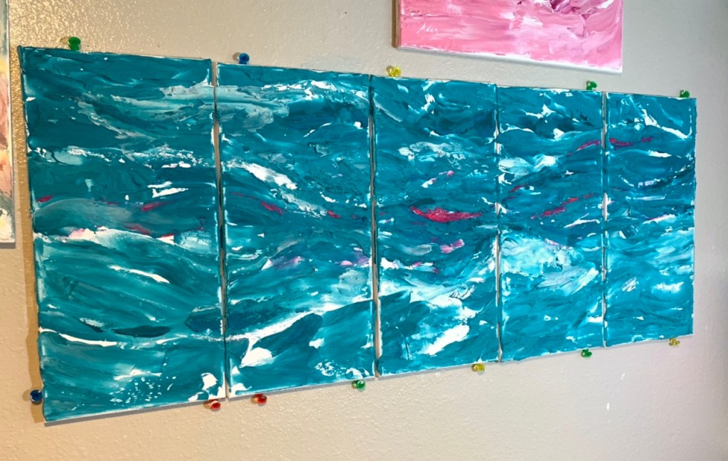
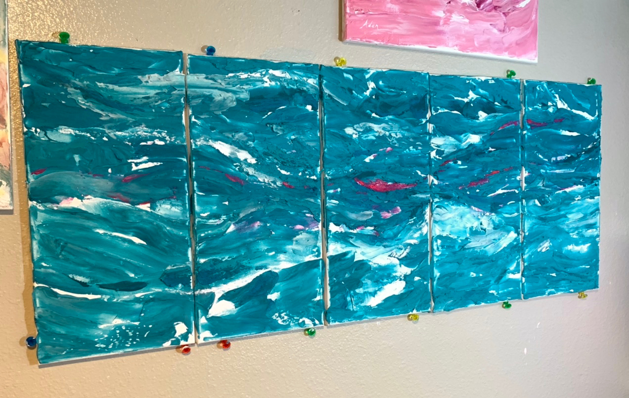
I don’t have an answer for the title question yet, but I realized, if I wanted to explore that idea/question, I needed to start a blog post thread separate from my initiating blog post series when I 1st started exploring working with multiple canvas panels.
I’m calling this new thread – Experimenting With Polyptychs, and my 1st question to myself is, how will my creative flow and enjoyment change or vary between painting a polyptych with panels slightly separated, vs painting a polyptych with the panels squeezed together close as possible, even though the work is meant to be hung or shown with space between the panels?
In my 1st series thread, Rearranging My “Art Room” at Home for a New Endeavor : Polyptychs , I explored new-to-me surprises about working a multi-panel art piece, like —
- the surprising way individual side-by-side pairing of panels created their own potential stand-alone art work!
https://felipeadanlerma.com/2022/03/18/march-18-2022-rearranging-my-art-room-at-home-for-a-new-endeavor-polyptychs-ie-art-on-2-or-more-panels-part-4-something-new-i-didnt-expect-painting-across-4-panels/ - the need for each panel to be signed, preferably front and back; possibly to prevent an exceptional or simply preferred pairing of panels being separated from the whole as a whole
https://felipeadanlerma.com/2022/03/21/march-21-2022-rearranging-my-art-room-at-home-for-a-new-endeavor-polyptychs-ie-art-on-2-or-more-panels-part-5-signing-the-backs-of-each-of-4-panels/ - how incredibly varied & creative the joining of edges between 2 adjoining panels can be!
https://felipeadanlerma.com/2022/03/25/march-25-2022-another-difference-between-multi-panel-art-polyptychs-and-single-canvas-work-working-the-edges-on-in-progress-red-blue-on-white/
Now, in my next post in this new thread, I hope to show and talk about what happened ( 1st time around anyways, ie, may differ for me next time around ) when – to solve regaining a stronger feeling of fluidity in my multi-panel work, I decide to paint the panels joined as closely together as separate stretch canvas panels would allow.
Turquoise Waves does carry “some” of the fluidity I feel / felt when creating most of my single panel abstracts, ie, like Turquoise Impressionist Abstract 1 below —

*
Related blog posts 😊
https://felipeadanlerma.com/?s=Turquoise+Impressionist+Abstract+1
Granted, Turquoise Impressionist Abstract 1 is not only a single stretched canvas, it’s also much smaller than Turquoise Wave at top, the latter being FIVE panels nearly the size of the smaller painting immediately above.
Much easier, for me, to retain the kind of fluidity I feel good creating.
Plus, all those things in the list above – multiple signing locations, multiple continuities and edges – aren’t a consideration.
What I’m gonna try is — pressing the panels close together as I can, and, use larger palette knives I just received the last few days.
My chosen WordPress image size limitations, to limit costs and preserve my image storage space usually doesn’t do the justice to my originals my files on Fine Art America do, but I haven’t had time or the right light to get decent pics of these newer polyptychs ( not to mention still needing to sign the fronts of each panel ). Once they are up, Fine Art America’s full resolution preview tool can give viewers a much cleaner clearer look.
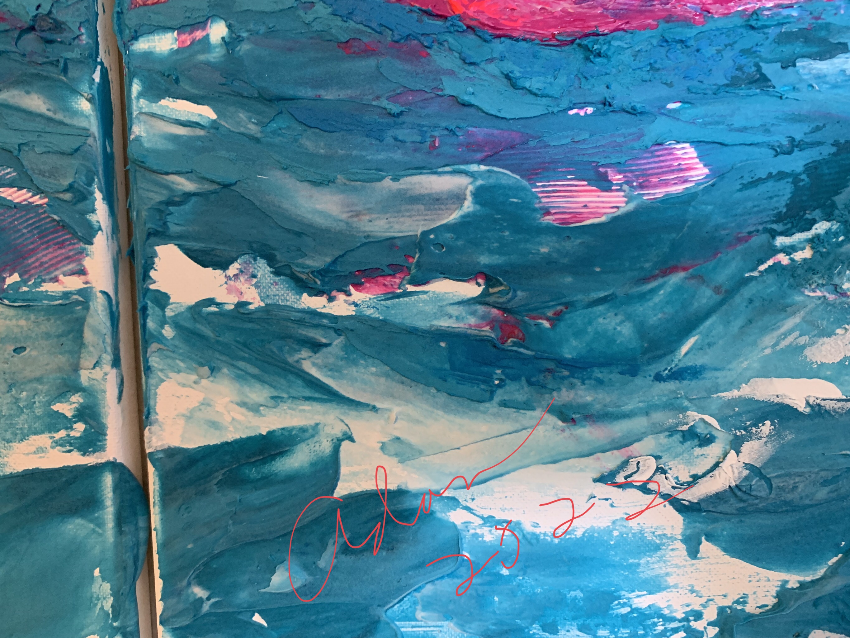
Meanwhile, here’s a detail shot from Turquoise Waves I hope you’ll like 🙏 😊
ps – the striated red & white paint lines were done via an old butter knife Sheila gave me ☺️
Stay well everyone! Explore the limits of your imagination! It’s said that, when you reach those limits, the edge, you’ll find a vista of new possibilities! 💕
Adan
– my blog posts re Polyptychs 😊
https://felipeadanlerma.com/tag/polyptychs/
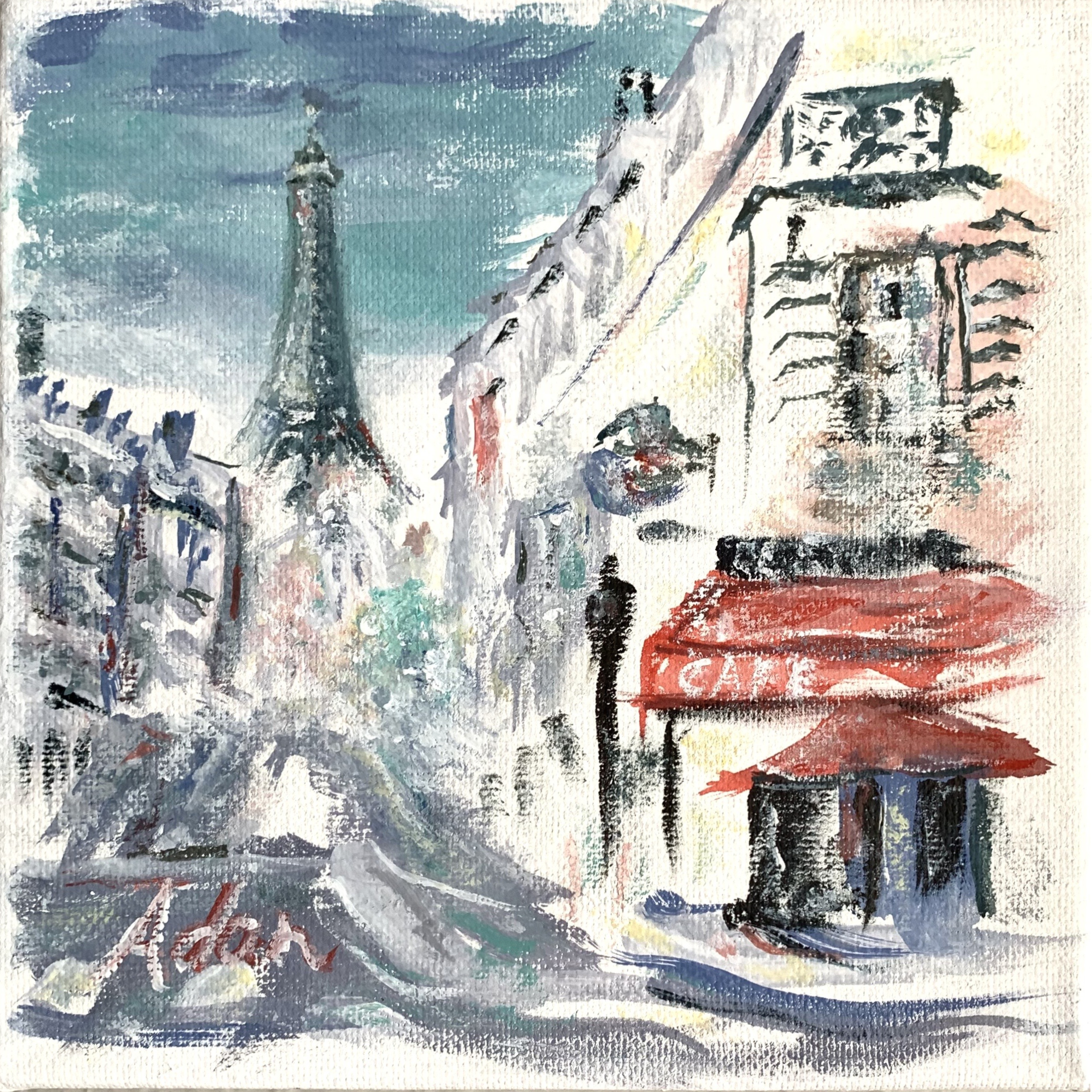
See & Buy My Art 👩🎨 🎨 ❤️
*
*
My Related Posts Here On My Blog
My Related Amazon Affiliate Search Products
https://www.amazon.com/shop/felipeadanlerma

My Latest Posts On My Website!
- Side by Side, Comparing the Same File With Differing Export Settings – 10.18.26, Updated 101926I feel this new format now presents the physical presence of my work closer to actuality as I myself see it, especially in regards to textures, colors, value changes, etc.
- Reformatting Images of My Art for Truer Representation, Even if Only Slightly“I know 1st things I’d want to know is how are my newer images better, and how can I apply this to more of my work….”
- My Most Viewed Image Last Week at #FineArtAmerica – Praying Together 2026 8×10I feel this new format now presents the physical presence of my work closer to actuality as I myself see it, especially in regards to textures, colors, value changes, etc.
- Reformatting Images of My Art for Truer Representation, Bit by Bit, LiterallyI feel this new format now presents the physical presence of my work closer to actuality as I myself see it, especially in regards to textures, colors, value changes, etc.
- Color & Texture — Texture & Color
- My Original Source Photo for Series of New Paintings – San Francisco Golden Gate BridgeThe image opportunity itself was via an evening boat ride my wife Sheila and I took on our so-far only trip to San Francisco a couple years ago.
- Intro: Grappling With Organizing My Series Paintings from My Original Photos into GroupsMy Collections page at Saatchi Art includes collections by style or place plus works in a specific series. Best I can do for now, lol! Hopefully improve over time 🙏 😊
*
Thanks again, everyone! 😊
Adan

Twitter / Instagram / FB @FelipeAdanLerma
Amazon Author Page – https://amzn.to/2YpgyUf
Fine Art America (FAA, Pixels) – https://felipeadan-lerma.pixels.com/

