
https://fineartamerica.com/featured/barton-springs-greenbelt-poster-version-2-pale-blue-felipe-adan-lerma.html?newartwork=true
Creating new uploaded-for-prints & gifts versions, from the same ongoing painted image, arose as an idea because of many reasons – both exploratory & practical.
Though it might seem it very unpractical not to begin a new painting for each version variation, I’ve found I get too derailed; often off-track from my initial purpose.
Complicating my choices of which way to go with an image, intensely so at times, was the fact that often – very often – I really very much liked some or each stage of development of the my new image; enough so to want to have prints or gift items for the evolving image at differing stages of my work.
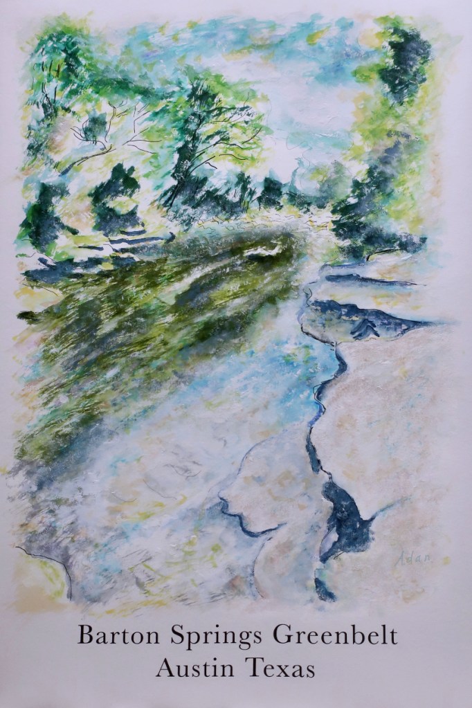
A good example is Pale Blue below right. My masking fluid inlay is pictured on the left.
I love the soft blues and easy to see line work I’d created.
I also knew, with the masking fluid in place, this stage of the image would not last; actually could not last. Watercolor (esp on paper) is fragile enough. But with masking fluid on it, subject to peeling away, and alway just a tug of being stripped away and changing the painting forever.
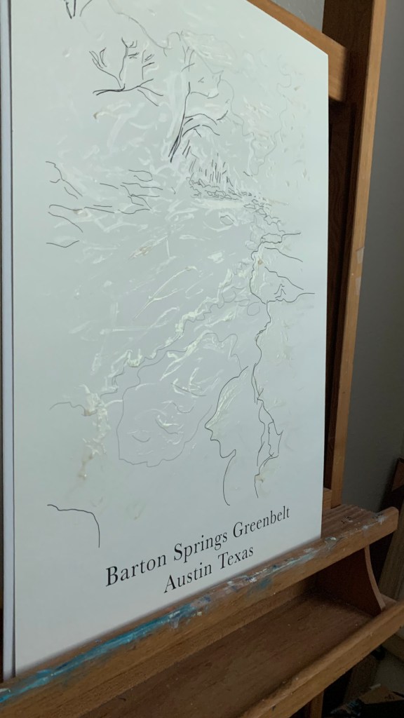
Masking fluid on Barton Springs Greenbelt line art poster version 2 ©Felipe Adan Lerma Barton Creek Greenbelt Poster Version 2 Pale Blue ©Felipe Adan Lerma
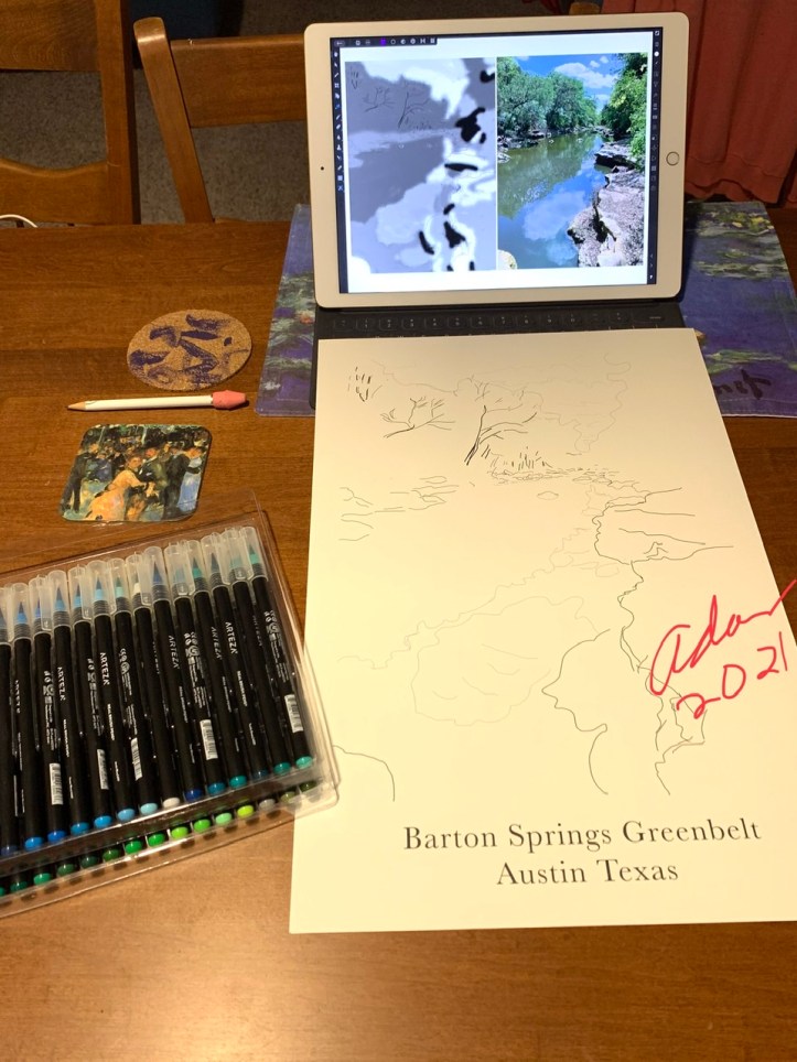
My initial poster off this design, finished in June, is below —
And one distinct difference in Poster Version 2 from it is, the pale yellow wash I set on the paper before I even added masking fluid.
The idea for the wash is actually not so much a setting-the-tone touch, as trying to implement an idea Dianne Mize recently pointed out in one of her art tips re how to unify the colors in a painted piece, achieve color harmony in one’s work. Here’s her short YouTube video on that – https://youtu.be/iHjJyVycck4 , and my series of reblogs of some of her art tips, are at – https://felipeadanlerma.com/tag/dianne-mize/ .
https://felipeadan-lerma.pixels.com/featured/barton-springs-greenbelt-austin-texas-poster-felipe-adan-lerma.html
And my template itself – which started a series of posts on how I developed the 1st finished poster – is shown below —
So achieving color harmony in this new work is one of my goals.
Another is successfully using masking fluid to create clean white areas in my watercolor.
Plus, have the white areas compliment and help create a sense of dappled light, one of my more recent obsessions, at least consciously so, lol! 😊
*
Take care everyone!
Enjoy our world creatively as possible ❤️
Adan
Direct link to image in above tweet 😊
https://fineartamerica.com/featured/barton-springs-greenbelt-poster-version-2-pale-blue-felipe-adan-lerma.html?newartwork=true
My Related Posts Here On My Blog
My Related Amazon Affiliate Search Products
https://www.amazon.com/shop/felipeadanlerma
My Amazon search for “Greenbelts and nature” –
https://amzn.to/3vpOpx0
My Latest Posts On My Website!
- My Original Source Photo for Series of New Paintings – San Francisco Golden Gate BridgeThe image opportunity itself was via an evening boat ride my wife Sheila and I took on our so-far only trip to San Francisco a couple years ago.
- Intro: Grappling With Organizing My Series Paintings from My Original Photos into GroupsMy Collections page at Saatchi Art includes collections by style or place plus works in a specific series. Best I can do for now, lol! Hopefully improve over time 🙏 😊
- Sold! At SaatchiArt — Tender is the Night 2024 – With much thanks to my buyer in Brooklyn NY!“Not only am I grateful to my Brooklyn buyer, but also to Saatchi Art that literally navigated me through the ice-storm prolonged process last month here Austin!”
- New Painting Series – Island Land Trail Sunset Vermont 2026 – Gaining Perspective About My Experience of Painting Doing Series of SeriesIt’s a welcome surprise to realize how rich one’s life experience can be, even within seemingly single short time frames themselves! I feel this new small study, with its misty soft blues and distant vistas is a nice reflection of that.
- Voter ID – ReVisiting John R. Lewis’ 2021 Voting Rights Proposal That Failed – What’s Different Now – And Why Not Debate it With the Current 2026 Voting Rights – Together?This is a short post I seldom write up. A political post. Understandly so. There’s a lot of the usual “they” don’t want this or that now talk from this or that political party.
- Are We at Our Kent State Moment? – One by One the Women Came and Said, It’s Time 2026 9×12 acrylic on canvas panel – by Adan – @SaatchiArt 😊“I still vividly remember the images on TV 1970 of students my age shot and on the ground during a demonstration against the Vietnam War”
- 1st Cabin Light Finished Painting 2026Saturations of sky and earth roll and rest spin like a first slow dance in junior high – middle school the grandkids laugh and tell me they think I make all this up just to be funny 😊
*
Thanks again, everyone! 😊
Adan
Twitter / Instagram / FB @FelipeAdanLerma
Amazon Author Page – https://amzn.to/2YpgyUf
Fine Art America (FAA, Pixels) – https://felipeadan-lerma.pixels.com/


Leave a comment